How to Design an Online Forms for 2X Conversion Rate
By :- James Mackie

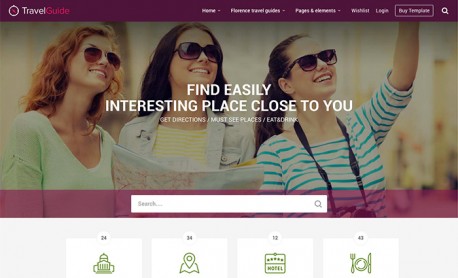
Online form optimisation is as important as dealing with other elements like the website's fonts. About 49.7% of organisations believe online forms bring the most crucial leads. Contact forms, surveys, shipping forms, registration forms and quizzes help businesses gather and analyse data vital for business growth.
So, here are smart tips on designing online forms for a 2X conversion rate.
Let's have a look!
Make the Forms Field Simple

There are chances that a long form will scare away the users, and they will avoid filling it. But on the other hand, a to-the-point, easy and interactive online form will double your conversion rates. Interestingly, an analysis of 40,000 online forms showed that the conversion rate increased with the decrease of form fields from four to three.
So:
-
Ask only what's valuable to you
-
Mark mandatory and non-mandatory fields
-
Introduce pre-filling for quick form filling
Choose Correct Colours
Right design and colours make a huge difference in doubling conversion rates. Use the right contrast in noticeable pop ups that don't feel too bright. These little changes in design will make forms more attractive, and users will willingly fill them.
Some of the tips are:
-
Forms design must resonate with your brand colours and landing page design
-
There should be a subtle contrast.
-
Use the same colour palette throughout the website.
Break it Up
Do you want to gather maximum information out of online forms? This is a great idea. It helps you modify your strategies according to customer needs to attain business objectives. So, to do so, break the form into multiple parts. For example, your form can have three parts.
In the first part, ask very easy questions, then introduce the next page option. This makes your form more visually appealing and short. Next, add a step completion green line at the bottom or top so that the user knows his progress.
This is a great design tip that doubles up online form conversion rates. Multi-part forms rather than one single lengthy form has more conversion rate and a very smart psychological design tip.
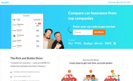
Make Your CTA Stand Out
The call to action button invokes many questions, insecurity, and curiosity among users. For example, what will happen if I click it? Therefore, UX designers are constantly optimising CTA buttons to make them clearer and more inviting. Some techniques are high contrast colours, fonts, and styles that are more inviting on the page for making an award-winning website with effective form design.
Avoid generic names like "Submit." Instead, you can use "Audit my website," "Click download for my information," "Subscribe to take help from an expert," etc. Using informative CTA buttons builds trust and makes users go for it.
Bonus Tips
Online forms in popups, chatbots, or basic online forms are crucial for any business's success. So, staying with the trends and optimising online forms' design for maximum conversion rates is a great idea. So, the trick is to be straightforward, flexible, use the right colours, and be transparent. So, see the tips mentioned above for the best results.
Recent Topics
-
 7 Best Project Management Tools for an Award-Winning Team of Designers
Organising and structuring your tasks and projects is critical, especially if you're a creative designer. Fortunately, there is a vast selection of project management software tools t...
Read MoreBy :- James Mackie
-
 How to Design an Online Forms for 2X Conversion Rate
Online form optimisation is as important as dealing with other elements like the ...
Read MoreBy :- James Mackie
-
 Role of Accessibility in Web Design
Technology makes things easy for people without disabilities. But do you know that technology makes things possible for people with disabilities? ...
Read MoreBy :- Navkiran Dhaliwal
-
 6 Mistakes When Hiring a Pro Web Designer for Your Website
When an organization starts looking for a pro web designer, it already knows the kind of projects for which they are hiring. Still, this process was never a cakewalk for any company. Howe...
Read MoreBy :- Navkiran Dhaliwal
-
 Why Submit Your Website to Web Guru Awards
Have you created a website for your business? If yes, then it's time to bring your business website to the limelight. Submit your website to ...
Read MoreBy :- Emma - Web Guru Awards Team
-
 7 Best E-commerce Website Designs for your Inspiration in 2022
In today’s world of digitalisation, your business needs an online presence to increase sales. So you should also have a user-friendly and responsive eCommerce website for your onlin...
Read MoreBy :- Rajita - Web Guru Awards Team